LYNDSEY BAKAL
Mellow
A Stress Relief App


The Problem
Through research and peer interviews of other college students, my team and I understood that there was a lack of stress relieving apps that were financially friendly yet personalizable and effective for every user.
Our Goal:
To create a new stress-relief app that helps users manage their stress at any given time while also giving the users the tools to learn to manage their future stress, all in one place.


My Research Pt. 1
Market Research & Competitive Analysis
Findings: My team and I searched through the top stress relief apps currently on the market. From this, we found that too many apps were charging too much and not tailoring the app to each user. The apps were also often too confusing and cluttered to amplify the calming experience.


My Research Pt. 2
Interviews
Findings: By practicing semi-structured interviews and using methods such as empathy mapping, I found that my peers were finding themselves constantly stressed because of problems like upcoming assignments, personal commitments, and uncontrollable & unforeseen issues with few current methods and little understanding of how to manage stress.
These interviews also gave us insights on what features we should be including in our app; some directly mentioned, and some solutions we planned to test the efficacy of.


Wireframing
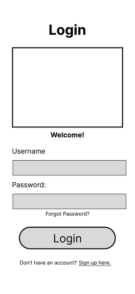


When wireframing this app, my team and I decided to focus on the features that were suggested by the people we interviewed while creating features that were solutions to the problems our interviewees mentioned as well.
Specifically, these are the screens I focused on; Login/Sign Up, Home, Journal, and Calendar. Our team used Figma to prototype the enitre app.
Please click here to view the entire team's work on Figma.
When designing these pages, I aimed for simplicity and functionality. As learned from the interviews and research, our target audience valued intuitive design along with a variety of ways to lower stress levels to choose from.
User Testing

When deciding how we were going to complete user testing at this stage, we knew we needed to be able to assist the users in the functionalities of the app, as this had not been prototyped yet. However, we wanted them to be able to find their own way through the app in order to see if there were areas where users were getting stuck or confused.
So, we created a list of tasks we wanted our users to try and complete with little to no intervention from us. We decided that the best way of doing this was to create tasks that involved every section of the app and actually used the functions we intended to implement. We wanted to see if the design decisions we made were intuitive of the user and if they could navigate through the app without needing guidance.
We also created reflection questions to ask the users after the tasks in order to gain more insight to how the user was feeling while completing the tasks as well as what areas could use improvement in terms of ease of use. This helped us identify patterns in user behavior and pinpoint specific areas where additional support, clearer design, or improved functionality would be needed.

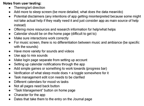


Results
All members of the team completed user testing with at least three different individuals. We strived for individuals that had different levels of knowledge when using mobile apps and different types of apps that they primarily used.
When finished with the user testing, we gathered all of the information we got from our individual tests and looked for patterns and similarities and prioritized them by deciding which changes would be the most beneficial in terms of intuitive design and functionality.
We found that users got stuck on a few different pages because of a lack of a next step available. There were also issues with feedback from the app as well as some functions seemed to be hidden to users. They thought the amount of methods shown was good, though they wanted more options for each of those methods.
We took the feedback we gained from user testing and began implementing it into the final design. Though, a lot of the users really wanted to see a more inviting design and we got many suggestions on adding colors and visual elements to make the interface feel more engaging. So, we got to work on choosing a design system.

Choosing a Design System
User testing also revealed we needed a name for our app as well as needing to incorporate solid design system. Due to time constraints, we decided that integrating an exsisting design system would be more beneficial to the project as a whole because we could save time for improving functionality while still making the app aesthetic.
All members of the team searched for design systems on Figma that we thought embodied the goals of our app. We found a few and then took a vote on which one was best. From this, we landed on Finastra.
We also used a similar process to finding a name for our app, though we brainstormed for a while about names that could fit before finally voting for Mellow.


The Final Design


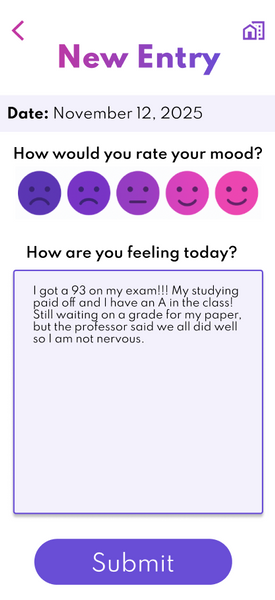
To view the entire Figma file my team created, please click here.
This is the final design of the screens I focused on for Mellow. As you can see, I incorporated the design system while polishing the features of the design and and refining the overall experience. Wrapping up this project pushed me to focus on the details that make an interface feel intuitive and cohesive, from spacing and hierarchy to consistency across components. I learned how important it is to balance visual design with usability, making sure each decision supports clarity and ease of use. This stage also helped me become more confident in making final calls without overworking the design, recognizing when something feels resolved. Overall, it strengthened my ability to think critically about my work and deliver a more thoughtful, polished product.